
Gel Printing with Alcohol Inks: Where Colour, Pattern and Happy Accidents Meet
There is something wonderfully unpredictable about gel printing with alcohol inks.
You can start with an idea of where you want the print to go, but the gel plate always has a little something else in mind. Colours mingle, patterns appear, areas of the print pull back in unexpected ways, and what looked ordinary a moment ago can suddenly become something quite special.
That element of surprise is one of the things I love most about this process.
In this video https://youtu.be/bH1IwiK-ymQ, I’m using alcohol inks on a gel plate to build a layered, colourful print using floral and decorative patterns. Rather than trying to make every part of the print identical or perfectly controlled, I’m allowing the colours and textures to develop gradually.
Starting with colour
Alcohol inks are particularly lovely for this type of work because of their transparency and movement.
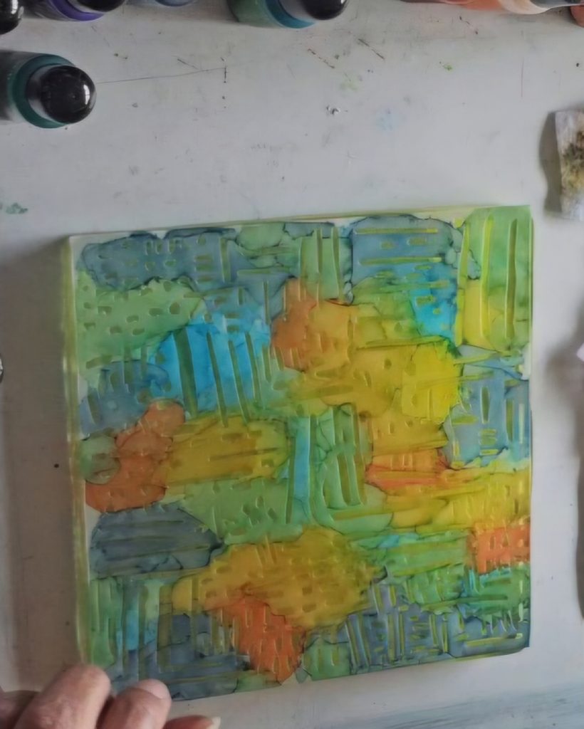
A small amount of colour can create a surprisingly large effect on the gel plate. Colours can overlap and blend, leaving areas that are soft and atmospheric alongside stronger, more defined marks.
For this print I’m working with greens, blues, yellows, oranges and pinks. The combination gives the finished piece a fresh, garden-like feeling.
I don’t necessarily have a finished image in my head before I begin.
Instead, I look at the colours and shapes as they develop and decide what the print needs next.
Adding pattern
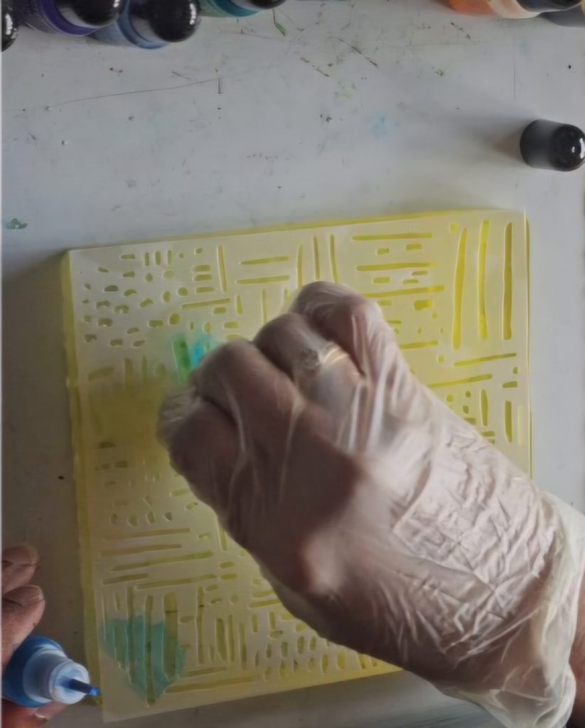
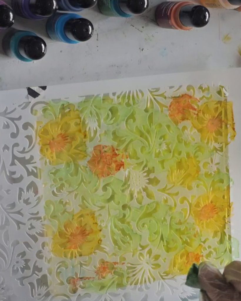
One of my favourite parts of gel printing is using stencils to introduce another layer of pattern. I used a piece of felt to dab the inks through the stencil, the first two times and the third time I just dropped inks on the stencil.
The stencil creates areas of repetition, but because the alcohol ink underneath isn’t completely uniform and the ink moves and spreads unlike acrylic paint, the pattern doesn’t look mechanically repeated. Some areas are stronger, some softer, and some almost disappear into the background.
In the video, you can see how the floral and leafy patterns gradually become part of the overall surface.
This is where the print starts to become interesting.
Rather than having one flat layer of colour, there are now several things happening at once.
There are areas that catch your eye immediately, while other marks sit quietly underneath.
Don’t try to control everything
I think this is probably one of the hardest things to learn with gel printing.
You don’t have to control every mark.
In fact, some of the most interesting parts of a print can come from the things you didn’t intend to happen.
A colour might spread further than expected.
A stencil might leave a softer impression than you anticipated.
Two colours might meet and create something completely different from either colour on its own.
Instead of seeing these things as mistakes, I try to treat them as part of the process.
The print is telling me what it wants next.
Building the layers
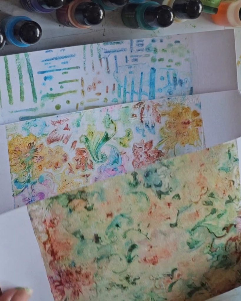
In this video, I have only created single layer of prints but with gel printing, I find that it is often better to think about layers rather than a single perfect print.
You might make a pull that isn’t quite what you wanted.
But that doesn’t mean the paper is ruined.
Another layer can change everything.
A quieter area can become the perfect place for another colour. A strong pattern can be softened. A small mark can become the detail that makes the finished piece interesting.
And sometimes the print that wasn’t supposed to be the good one turns out to be your favourite.
Look closely at the finished print
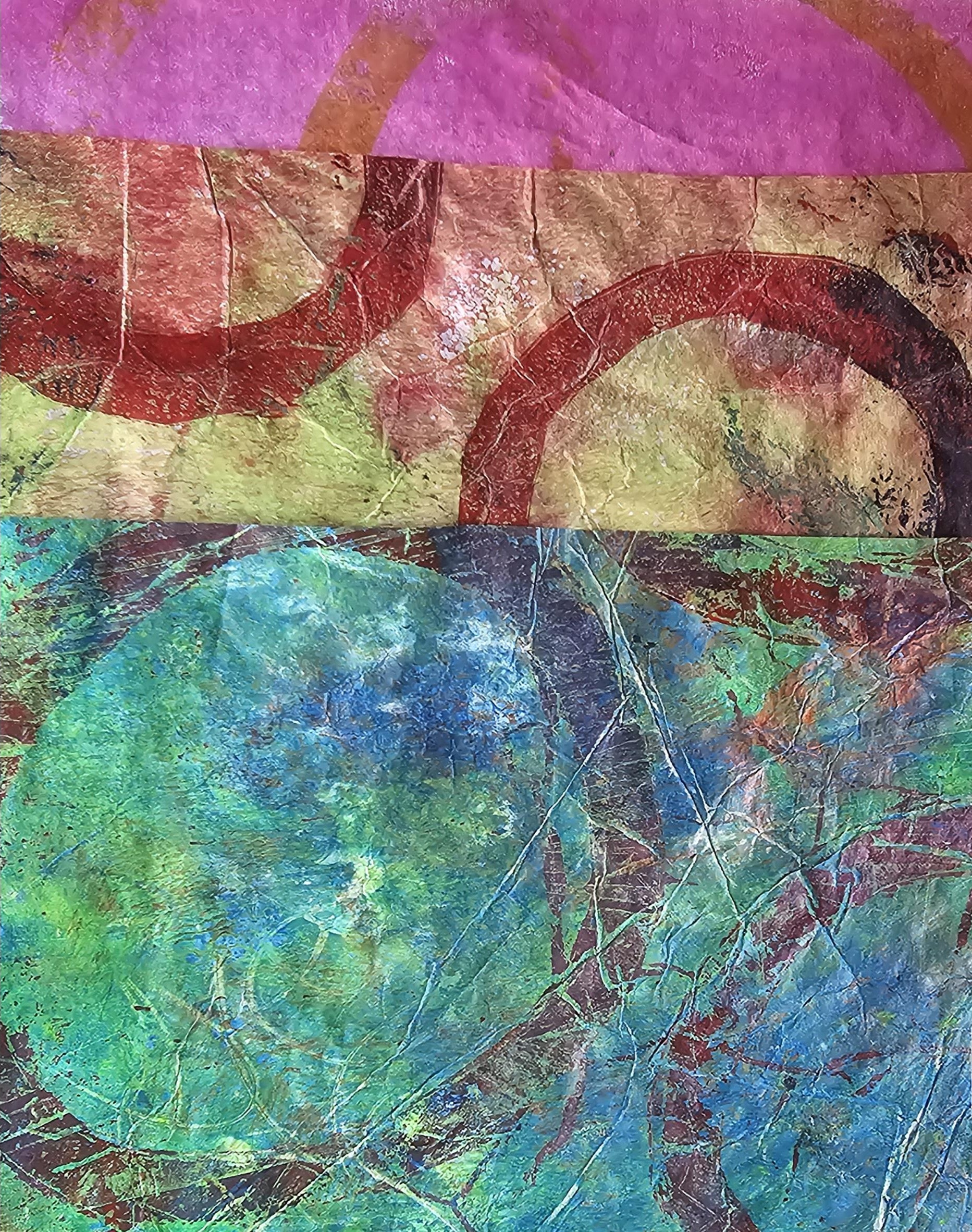
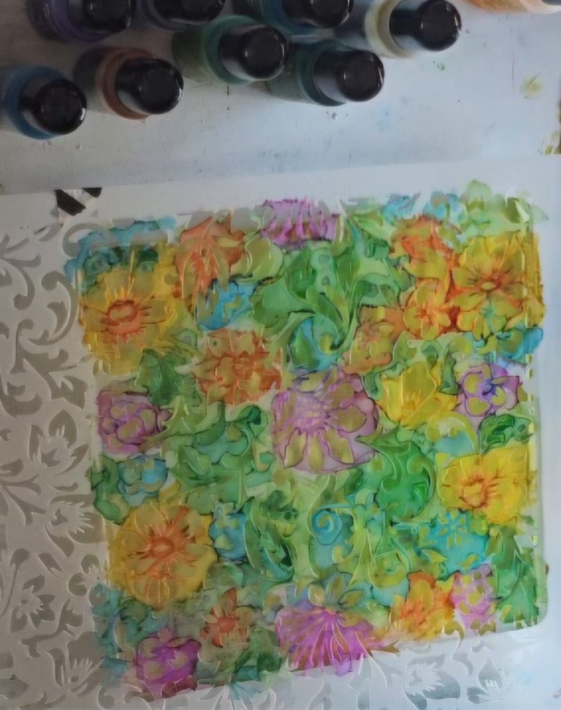
When I look at the finished piece from this video, what interests me most is the amount of visual information contained in it.
There are flowers, leaves, curves, little fragments of colour and areas where the layers have blended together.
It doesn’t need to be a perfectly recognisable picture.
It can simply be a beautiful surface.
And that’s one of the reasons I enjoy gel printing so much.
The process creates possibilities.
You don’t always know what you’re going to get — and that’s exactly the point.
Try it yourself
If you’ve never tried alcohol inks on a gel plate before, start small.
Choose a few colours that work well together rather than trying to use every colour you own.
Add a little colour, experiment with a stencil, make a pull and see what happens.
Then look at the print.
Don’t immediately decide whether it is “good” or “bad”.
Turn it around.
Look at it from different directions.
Look at it from a distance and then close up.
You may find shapes and possibilities that you didn’t notice at first.
And if the first print isn’t what you hoped for?
Make another layer.
That’s the beauty of gel printing.

Leave a Reply